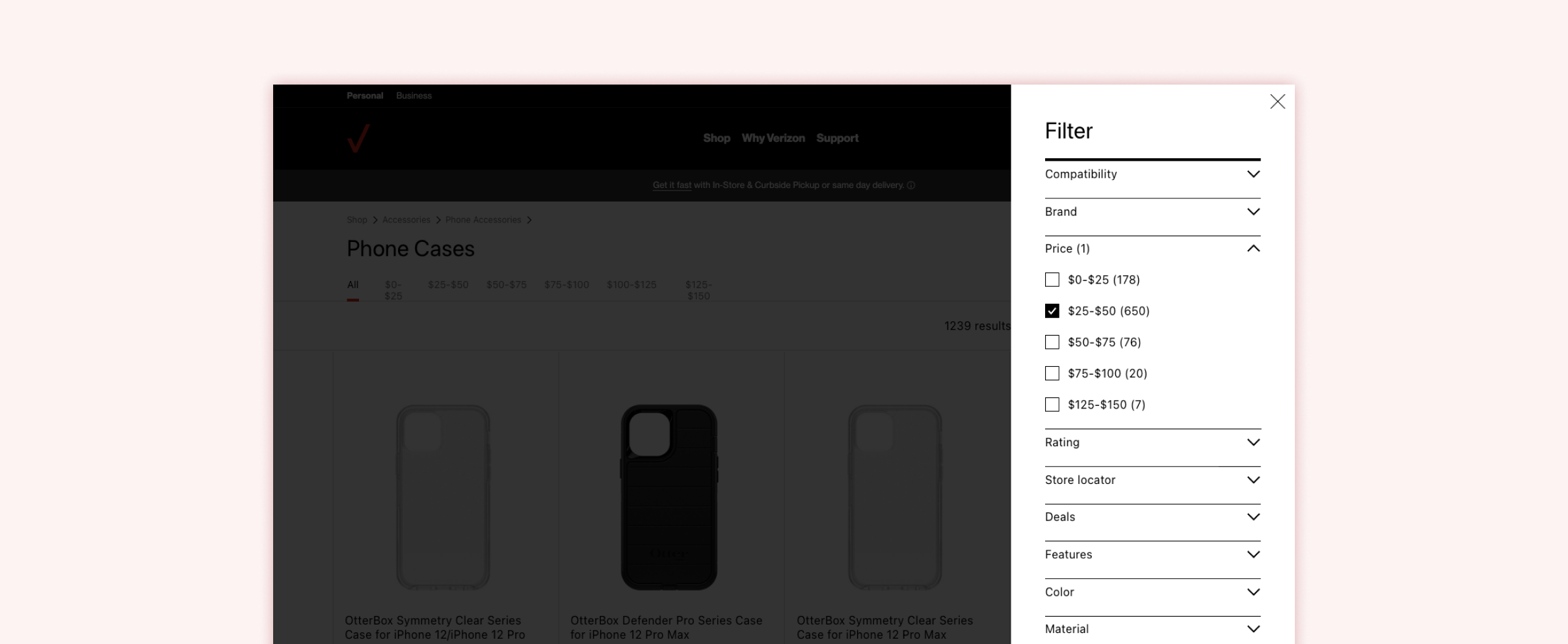
Product Filter Experience Redesign
Verizon aims to provide a best-in-class shopping experience by delivering intuitive user interface and interactions for customers throughout the journey
My Role
Experience Designer—Design, Prototyping
Team
Visual Designer — Sophia P.
User Researcher — Kristina T.
The Problem
User testing revealed customers may have been struggling to find and utilize filters effectively when shopping for products on the Verizon site.
We partnered with Verizon to understand pain-points and propose a design which allows users to navigate and make decisions more easily.
Background
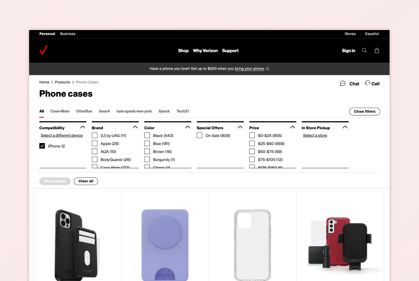
Verizon tests components on their site in an effort to continually improve on areas where customer needs can be better met. While the previous filter experience was designed to provide scalability as well as adhering to brand standards, but proved to be causing issues for some customers.
Some key points were identified and were taken as inputs when considering our concept vision:
Customers frequently felt confused by the horizontal layout of filters which deviates from the industry standard vertical orientation
Customers had trouble interacting with height restricted facets.
Concept Vision
Our team researched best in class experiences as well as other patterns in use throughout the Verizon site in order to provide a recommendation which provided maximum value to customers while encasing the experience as well leveraging existing components in the development library.
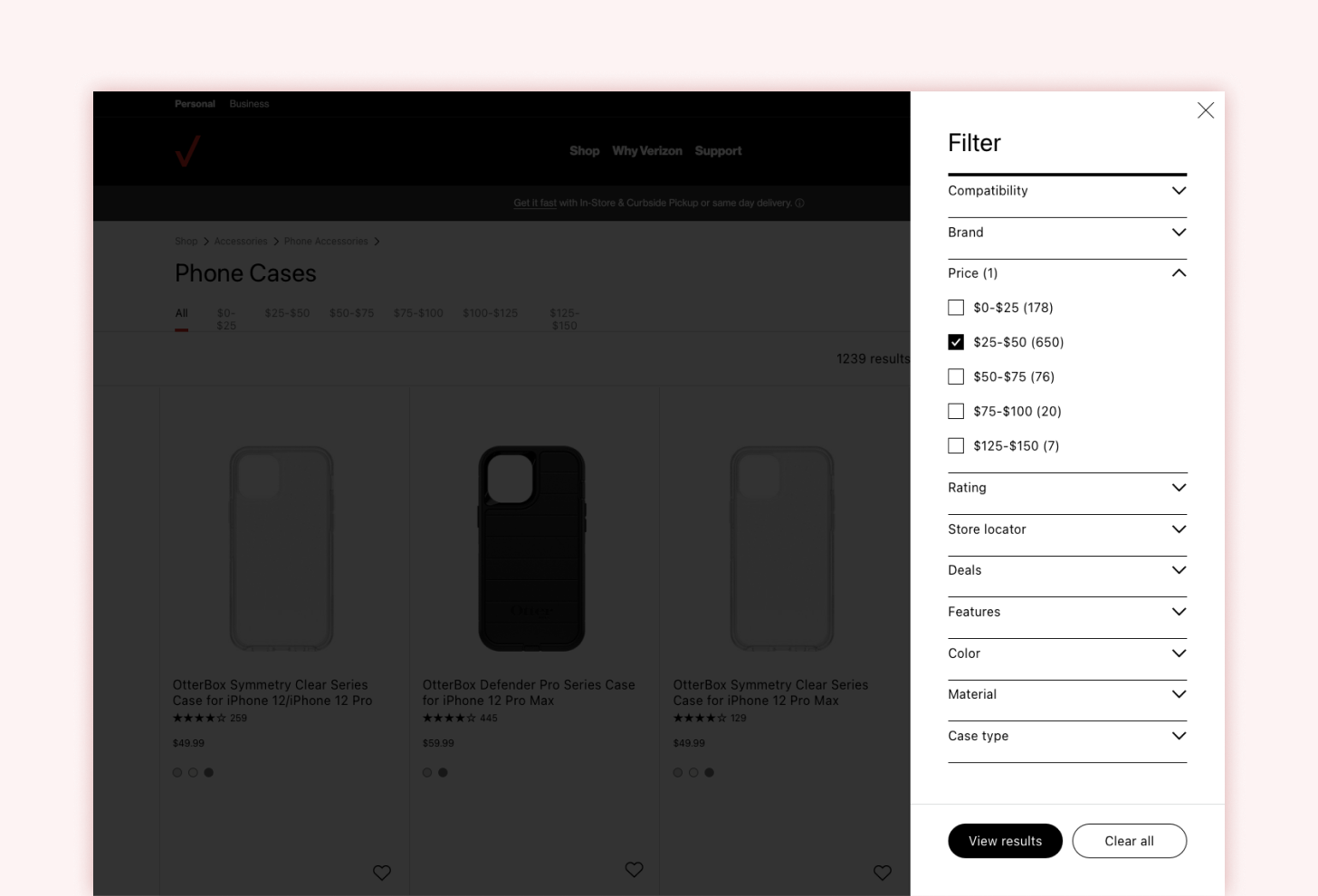
We proposed and tested an enhanced filter experience which incorporates heuristic best practices to provide a more intuitive experience for users.
Keep focus on task
We recommended a modal approach to provide focus on the task of filtering while also keeping order to help customers navigate quickly through the task of filtering items.
Utilize familiar patterns
The previous filter experience required users to understand a proprietary pattern for filtering which resulted in confusion with customers. We proposed an established pattern to the component in order to remedy this.
Minimize time spent
We proposed a vertical orientation to the new filter component in order to allow users to quickly scan the list of available filters as well as provide more area for long lists which may appear for products
User Testing
We proposed a test plan which would allow us to evaluate the performance of our proposed component against the existing implementation
Target Details
Verizon customers & prospective customers
Mix of incomes, ages, ethnicities, education levels, employment status and genders
Have not worked in the following agencies in the past 5 years:
Advertising
Digital design
Market research
Telecom
Marketing
Key Questions
Are UI patterns intuitive?
Is one experience more time consuming than the other?
Is the selection and application of filters intuitive to customers?
Is one experience preferred over another?
Methodology
12 total participants
Interviews were conducted remotely
1-on-1, 60 minute sessions
Each participant saw both versions of the prototype in varying order
Sample Tasks
Imagine you are searching the Verizon site for a new phone case for your iPhone 12
Task 1: You’d like to spend between $30-$50 on a phone case . How would you go about finding these cases?
Task 2: You want to make sure you find a case that fits your iPhone 12 and have heard great thing about the brand Tech21. How would you go about finding these cases?
Task 3: Now that you’re seeing Tech21 products, you want to make sure your case is antibacterial. How would you go about finding phone cases that meet this criteria?
Task 4: After seeing the results, you decide that you’d rather have a leather case, and you’re open to any color available. How would you go about finding these cases?
Task 5: You don't like the results and want to remove all the filters you’ve applied.You decide to search instead for just waterproof cases in preparation for an upcoming beach vacation. How would you go about finding waterproof cases?
Outcomes & Takeaways
Overall, customers expressed a strong preference for our proposed vertical oriented filter component. Small font sizes and scrolling within filter facets were key contributing factors to customers negative feelings around the previous version.
Although customers had a preferred version, there are still aspects which can be improved such as filter names which appears to be confusing to customers. Verizon aims to address these concerns in upcoming efforts.
Testing Takeaways
Customers regarded our proposed design as the most preferred version
Most customers preferred the vertical orientation and described the layout as “sleek”, “modern” and “neat”
BAU filter experience causes feelings of overwhelm
Customers experienced cognitive overload from the quantity of filters
Customers knew how to scroll within facets but suggested facets should be listed in alphabetical order
A few filter facets were unclear and caused some confusion
Customers struggled to decipher the meaning of a few filter facets (Compatibility, Case Type, Material)
Customers confused the indicator of number of filters applied with number of products available after filters are applied